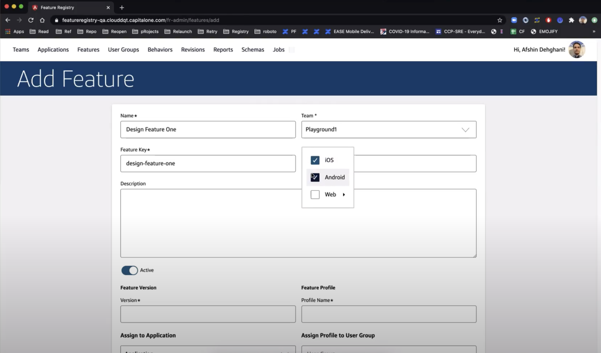
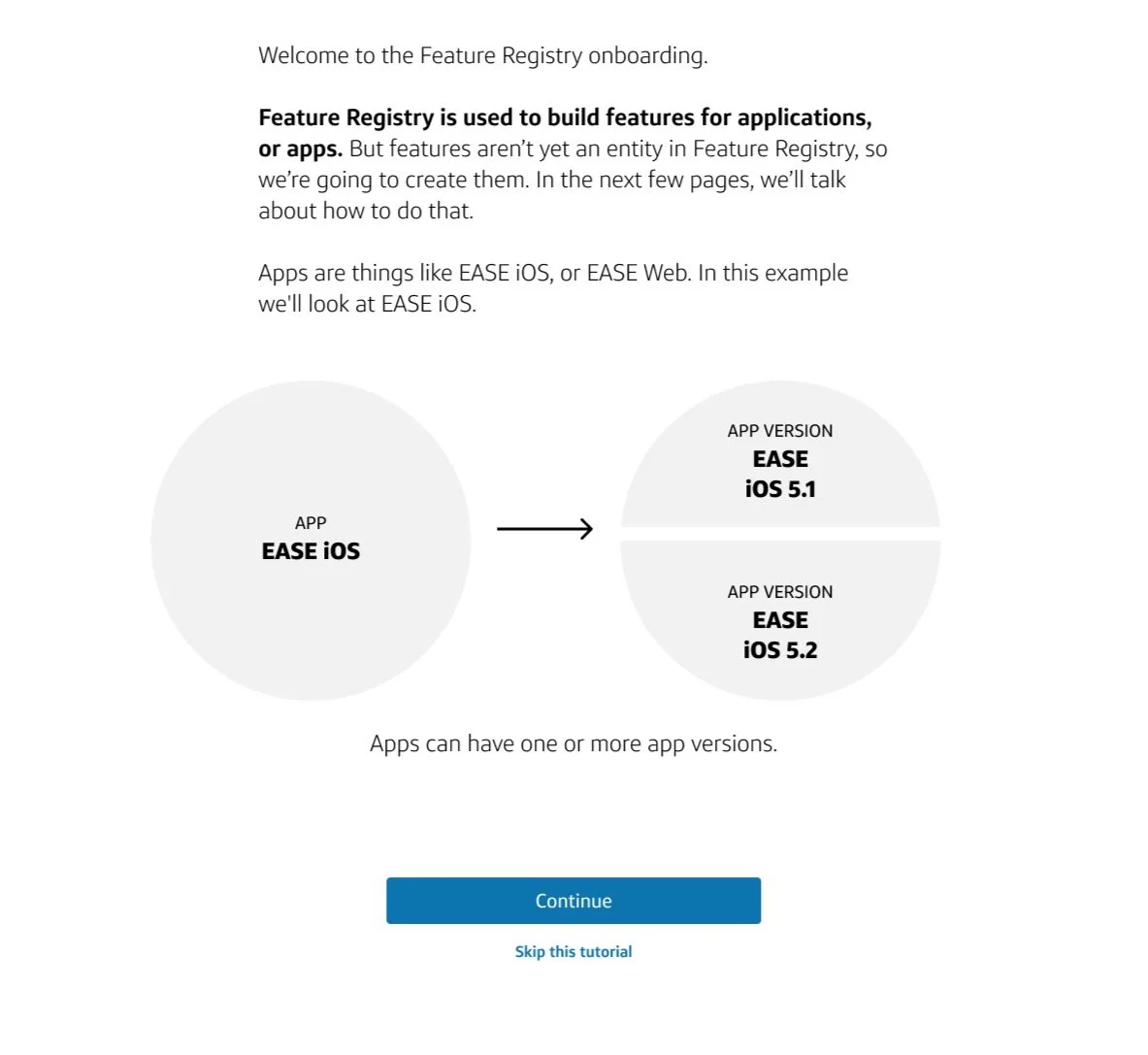
Feature Registry Redesign

Leading the redesign of Capital One’s feature management portal.

THE FOLLOWING MATERIALS ARE INTENDED TO BE VIEWED BY CAPITAL ONE ASSOCIATES ONLY. IF YOU ARE NOT A CAPITAL ONE ASSOCIATE YOU MUST EXIT THIS SITE NOW.

Feature Registry is an application used by Capital One associates to create and maintain customer features for the app and website

Project Profile

Position: Content Strategist, then Design Lead

Design team size: 5

Users: More than 250 potential engineers and product managers

Value: Millions in revenue generation, customer satisfaction, NPS/brand association, sev incident response times

KPI: Number of registered features, number of registered users, sev incident response time

Stakeholders: SVPs in Enterprise Product and Tech

Time: 10 months

Feature Registry’s problems were holding the company back in NPS and revenue

Lost Revenue

Slow Response Times

+

=

Production Bottlenecks

Product team presented the problem as a matter of rewriting the current content 

The original Feature Registry application was just a form. Users found it very difficult to understand.

The research showed that users avoided Feature Registry because they feared it

User Challenges

Found the system hard to understand

Did not know how features worked in general

Feared making a mistake on Feature Registry and causing sev incident

Design Challenges

No one knew how the whole system worked

Small number of users who knew how to use the Feature Registry application

Language rewrite wouldn’t fix the larger problems of knowing how the system worked

The design lead left the company; I served as interim design lead

I reframed the problem and proposed new solutions to the product team

We moved forward based on my new vision and strategy and engaged a full design team of five plus PM and tech partners.

Updated UI: Eliminating forms in favor of a a guided user experience

Concept Mapping: Documentation of the system architecture and concepts for reference and review

Onboarding: Embedding instructional content on how to manage features

Migration Feature: A bridge to bring in users reluctant to copy over their feature data

My Teamwork Processes

I designed and facilitated four stakeholder workshops to define the destination state vision

Strategy

Design

Content

Technology

I built an ontology to visually document how the new system worked and get stakeholder agreement

This “ontology of wine” slide is from a deck I presented on how to build ontologies. We used the same framework to map out the concepts, their definitions, and their relationships to each other in Feature Registry.

I guided my team to use a content-first design process to build out the user interface

Ontology (IA)

The first step in breaking down the complexity into the key concepts

Language

Turning the terminology into easily understandable on-page language

UI Design

Using the terminology as content building blocks for the UI

The Results

We now had a prototype for further refining and testing. Initial usability measures via UMUX Lite were trending positive. Select screens from the initial prototype are below.

Initial testing showed that usability scores increased

2.3

5.1

Onboarding Interface

The onboarding pages were written to accomodate first-time users. Large blocks of text were replaced with easy to understand diagrams, and were rated higher by users in usability testing. The following screens are protected by NDA; portions of the content are reproduced below:

I wrote, tested, and refined all of the user-facing content below.

Onboarding Interface

Defining basic terms and providing instruction was the most important part of the content, per user feedback 

Redefining terms was essential to get everyone speaking the same language

Showing people what they needed to do before they did it helped them to trust the process and relieve anxiety

Users now had a guided process to create and import features in Feature Registry

Users reported reduced anxiety because of the progress indicator in the right sidebar, as well as the on-demand access to support documentation and the onboarding content.

The onboarding documentation was made available in the expandable green box so users wouldn’t have to hunt around for documentation, one of their biggest complaints.

The final screens let users review before submitting, increasing confidence and trust

The feature confirmation modal guided users to other relevant content based on the content map

Epilogue:

I took on a new design lead role before the deployment of the Feature Registry MVP, but I would have tracked the following metrics to measure success:

-NPS scores

-UMUX ratings

-Time to onboard

-Attrition among users

-Sev incident response speeds

-Feature development speed (averages)